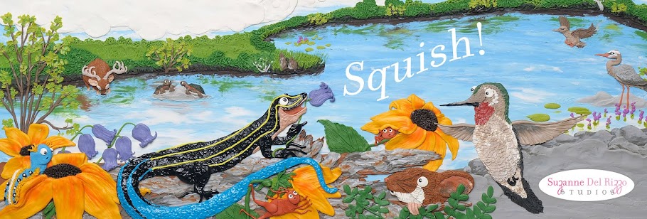


If you have been over at my new website, you may notice that did a little retweeking. I rearranged the layout of the "Home" page and changed the way the portfolio images are viewed. At first the portfolio images opened up in a new window but I changed them to open in the same window for ease of navigation. I took the great advice form my friends in the zero2illo forum, and also moved up my image rotator on this page so that most of it is visible once you land on the page and then you don't have to scroll down to get the full image. I also decreased the height of my header as well, to help create more space for the image rotator. At the top are my favorite 2 of the 9 variations I came up with for a new header design. I know 9, yeah...totally type A of me- hahaha.
I opted to go with the top header image. If you have a preference I'd love to hear it!:)
Now that the website is live I am looking forward to getting back to messing around with my plasticine and get creating. I have a project I hope to finish in a few weeks so stay tuned for updates.
Bye for now!

2 comments:
I LOVE that image of the mouse eating the cake...so cute!
A couple things stand out to me just from your front page...the cloud like tiled background image doesn't go all the way across on my monitor...It does on this blog. Hmmm. I'm using Google Chrome.
The other thing is the current banner/header shows a very small contact info...hard to read that email address which is MUI important. I think your name and contact info should be big and readable. Maybe you don't need your name, since you have a nice logo with you name and "studio" in it...
Of the two banners you have posted above...I like the top one...but think the contact info should be bigger and maybe even a different color. That pink really vibrates against the earthy tone.
Well done! I think you've done an exceptional job showcasing your art!
Post a Comment